
Data products are a completely new terrain and require an extended design strategy: Data UX Design.
User interfaces for data products have the task of making complexity understandable for the user*. Anyone who wants to build a data product that needs to communicate data and complex models to users faces a special challenge with an unexpectedly high level of difficulty.
After all, data products are not just another software product. 85% of all Big Data and AI projects fail. The reasons? In my experience, they are not in technology, but in design.
My very first data product in 2010 was a kind of Tableau for Online Marketing. It failed mercilessly. Technically, it worked wonderfully. You could connect any data source and configure your own dashboards. Optically it did look pretty good, too. But almost nobody wanted to use it.
That really got me down. I wanted to find out why and how to do it better. My personal learning after many years of data product design: Successful data products are feasible if you keep a few things in mind.
So what can you do to bring a successful data product into market? The answer has a lot to do with a new kind of UX design. As UX designers, we are dealing with several additional layers that a traditional software product usually doesn’t have: a pretty complex system that the user may not even understand, data and data visualization, possibly artificial intelligence, and last but not least, a whole different kind of user problems or jobs to be done.
The following 9 questions you should ask yourself and your team before you start with the Data UX design.
1. Which user problem exactly does your product solve?
The Designation Typology classifies data products according to their user needs or business tasks: Actionable Insights, Performance Feedback Loop, Root Cause Analysis, Knowledge Creation and Trust Building. A localization in this landscape is helpful. Some of the above tasks have non-linear user journeys, which requires new UX approaches.
The specific task of your data product must be clearly visible to the user in a few moments.
2. What exactly does the system look like?
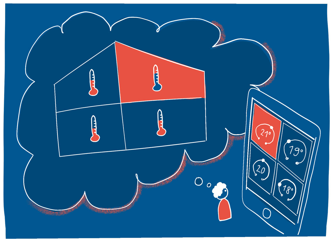
All right, the system behind the data can be really complex. Whether it is the optimization of a chemical plant, the standardization of procedures in the operating room, or the seamless interaction of heterogeneous devices in a household: not only must the entire project team have a common understanding, but your users also need a sufficiently accurate and correct mental model.
Don’t rely on the assumption that users already know everything to interpret the data correctly. Testing and training of mental models is indispensable.
3. How good is the data quality?
Sad but true: Data are no facts. Even the decision itself of what is measured, or what data is collected, is a human decision. Often it simply depends on the technical or legal feasibility. Often only those data is used which is already there. Sometimes there are measurement errors and failures. Sometimes the statistical transformations and aggregations are wrong, misleading or contradictory.
An additional aspect: in the rarest of cases, the information that is really needed is actually measured.
Imagine you would like to measure the quality of education at a university. Unfortunately, this is not possible directly. Instead, you can only measure indirectly: the final grades, or the failure rates. These are, however, only proxies that may be an indication of the quality of learning, but can also be misleading. Data is quite fuzzy!
The data quality must therefore be reflected in the user interface. We do not want users who trust our app blindly, nor do we want users who fundamentally doubt all data. A good data UI leads the user to an informed-critical trust.
4. How high is the graphicacy and numeracy of your users?
Data visualizations are ultimately data encoded in a graph. The reader must first decode the graph to get access to the data. This is called graphicacy. What does a dot, line, color, position or length mean? Do readers understand less familiar chart types such as histograms or scatter plots?
Once the data has been decrypted, it must be interpreted. How good are users with numbers? What statistical challenges do they have to overcome for this data product?
Make sure with user testing that your target group can decode and correctly interpret the data and visualizations.
5. What level of detail do I need?
How many details does the user need to know to understand the situation and detect the signal from the noise? Are averages and sums enough, would be a distribution better? Which time intervals are suitable for timelines?
You should also keep in mind that aggregated data is often too abstract to be linked to your own mental model. “As simple as possible” is unfortunately too simple. This is because details are able to explain abstract data and can build trust. On the other hand, too many details can be quickly overwhelming.
6. Are you dealing with probabilities?
If the data you want to communicate is based on predictions, classifications, or samples, you should be alerted. Impress the data scientist by asking her about the confidence interval. The makers of weather apps seem to assume that everyone knows what “60% probability of rain” means.
Unfortunately this is not the case, because probabilities are tricky and in need of explanation.
The common practice of omitting all uncertainties makes the user interface deceptively simple – and dangerous.
This has already led to many misunderstandings and wrong decisions.
7. Is there a data visualization expert on the design team?
UX design for data visualizations requires a special skill set: The skillset of a Data UX Designer. From data analysis, data design workflow, visualization tools and libraries to chart types, color palettes and data storytelling – not necessarily what you learn as a UX designer. It’s good to have an expert on the team or at least a mentor within reach.
8. How can I get user feedback?
As soon as there is a first prototype, valuable feedback should be collected through user testing. A click dummy is needed for this. However, lorem ipsum texts and dummy data are not particularly suitable for data products. Because very often data products are uncharted territory in their function and in the way they solve a user problem, even for users.
The user must be able to imagine how the finished application will solve her individual problem. Only then she can assess the value proposition and give helpful feedback.
Incoherent random numbers are too abstract for this. Therefore, all content, especially numbers and data, should be as realistic and coherent as possible. In addition, the interactive path through the click dummy should tell a story, for example how a problem becomes visible and then be solved. As a result, many elements of the user interface will be self-explanatory in an elegant way.
9. Can the user interface give a boost to marketing and sales?
If the user interface clearly communicates what it does and what the process is like, it qualifies for a lucrative part-time job: it can sell the product. Sometimes it is almost impossible to express in a few words what the product can do. Especially if there are no similar known products yet. If you sell shoes, it’s enough to put a sign in front of the shop saying “shoes”. Everyone knows what shoes are, what they are for and how to use them. (The point in this case is to stand out from the competition.)
But if you want to sell a predictive maintenance system for chemical plants, for example, not even the customer’s experts know exactly what your system can do and how to use it. But that’s exactly what a well-done user interface can explain in a few moments.
Our personal conclusion
We must acknowledge that data products are a completely new terrain. They’re not just another software product, or another business intelligence dashboard.
It is also not only about data visualization. To build a successful data product, we need a special strategy, an advanced UX approach: Data UX Design.
Author
Evelyn Münster, Data UX Designer and Managing Partner bei Designation
* These and all other personal denominations in the article shall also include male persons.