I spent a couple of years creating exploratory analysis tools for the wrong audience.
There are quite a few ways to classify data visualisation tools, but one of the most common distinctions is exploratory vs. explanatory tools. While many data visualization designers focus on storytelling, I like to build tools for dynamic data exploration.
As the saying goes: In writing, someone has to do the work – either the author or the reader. Having the reader do all the work is a bad writing style, but it is indeed a valid option for data visualization: It is called exploratory data visualisation.
Exploratory tools let users study previously unseen data. Often, the data is frequently updated and also personalized, e.g. for online marketing or business intelligence analytics. There is no author or editor involved who has seen the data before, so the user has to do all the work. What work exactly? Basically, to develop meaningful stories from a raw dataset.
Consider a typical example: After carefully exploring an online marketing dashboard, a user concludes that affiliate channels drive twice as many conversions when combined with e-mail. That’s a great story or a so-called actionable insight! It is a very valuable message that can lead to real business improvements. It is what we hope our customers will draw from the dashboards we give to them.
But somehow, they don’t.
A bland chart makes users feel helpless
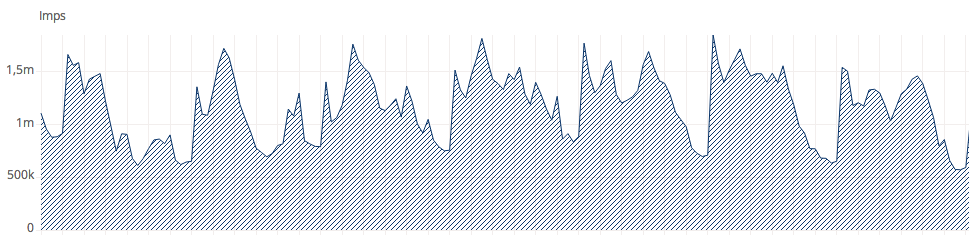
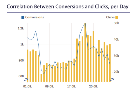
Users look at the timeline and wonder if the ups and downs mean anything
Imagine a beautiful looking dashboard with a timeline, some bar or pie charts and maybe even a more advanced chart like a funnel. There are also some interactive group and filter functions. Alarmingly, my tracking data reveals that 90% of registered users haven’t opened the dashboard in the last week, and the remaining 10% only downloaded the spreadsheet. Why would this occur?
People keep telling me that looking at their dashboard makes them feel helpless, clueless or even guilty for not being able to make sense of it. They look at the timeline chart and wonder if the ups and downs mean that all is normal, or if there is a problem? What the hell are they supposed to discover, what actions should they take? Some people approach the dashboard with a specific question in mind, like “Is my campaign on budget?” or even “Why is my campaign over budget?”. But after clicking around for a few minutes and finding no answer, they eventually give up.
Can an explorative tool really tell a story?
An explorative dashboard has so many powerful views and buttons, but if the audience doesn’t have enough visualization literacy, it’s just the wrong approach. How can you fix this? After all, the data presented in the charts is highly dynamic, and nobody has seen it before. At dashboard creation time, designers simply can not foresee future data. Can interpreting the data be automated?
The answer is, it can’t. Automated sense-making and judgements about the importance of an anomaly is currently far beyond the capabilities of machines. Even anomaly detection is still something machines fail to learn.
That’s why we still need a human in the loop. Humans have a natural talent for making sense of complex patterns that we have never seen before – even without a degree in statistics.
In short, the storytelling will remain the user’s job, but a good dashboard can go a long way toward giving the user all he or she needs to see the story. As a designer, consider the facts you do know beforehand, and provide as much assistance as possible. The more specific a dashboard is, the more assistance it gives. That takes a lot more considerations and effort than building eye candy charts – but it makes a huge difference to the usefulness and user engagement of the dashboard!
Know your user’s questions
So how do you do it? The gold standard is to know the user’s questions that need to be answered by your tool. If you already have an audience, if you know that audience, and if your audience is already familiar with the data and the topic, then the best thing to start is doing user testing and research. Do your users rely on a tool made by your competitor or plain old spreadsheets? Ask them to show you their working steps and their final results. Consider the message they communicate, how they communicate and to whom. Was it tedious to arrive there? Are the resulting messages and topics greatly varied? Are there questions still unanswered? Did they draw spurious conclusions? The results you get might be a good starting point to build a story-telling-assistance tool.
Often, it is not possible to know the user’s questions in advance. Maybe your tool is new and will solve a problem nobody has addressed before. In this case, the real world questions will come up in production and can only vaguely be anticipated. Maybe the few potential customers or prospective users you know have only limited imaginations and data literacy to come up with interesting questions in advance. So you have to start the project without knowing the exact questions the tools needs to answer. I encountered this situation during one of my recent projects, when TV broadcasters see their SmartTV data for the first time. In such cases, an iterative design process is crucial. Build simple charts and get specific step by step. Empathize with your audience, get feedback when possible, be creative and gradually add assistive features.
Here are 9 ways to evolve your exploratory tool towards an explanatory tool
1. Make it simple
Don’t overwhelm the user with a configuration wall
Don’t expect users to take action before seeing the first valuable chart, instead hand it to him on a silver platter. From there, it is easier to take the next step.
Show only one chart at a time. Divide the dashboard in topics and make one tab or page dedicated for each topic.
Display the most important information first, e.g. an overview or possible problems. Reduce options and controls, or at least hide them. Instead, think a lot about sensible defaults, and just make it look at little less tool-y and exploratory.
2. Add basic context
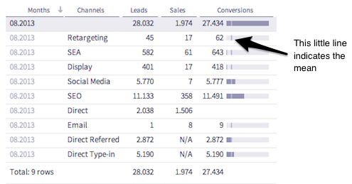
The mean helps to interpret the spark bars.
Color boxes can help to detect click fraud by indicating probability ranges.
Lines and arrows add context by comparing this week to last week.
Context can help to judge a value. Imagine pondering on the number of conversions of channel „affiliate“ this week. Did this channel’s conversions reach the goal this week? How did it perform compared to last week? How did it compare to the best-performing channels this week? Was it above average? Add goals, benchmarks, averages, ranges, maybe even a histogram, a time comparison, or a baseline. Whatever you know or feel might be relevant – but be sure to add it sparingly, avoid cluttering the interface.
3. Use more text
A good title is the entrance door to the chart.
We all know about the power of narratives of combined text and images. Just think of comics or films! Text is a great companion to charts. Try to dynamically create a sentence for each chart, stating the big picture. It’s like the entrance door, leading to the chart details. Once users have grabbed the gist, it is much easier to delve into the figures.
4. Highlight the important stuff
We already discussed that it is not easy to algorithmically find the important stuff, but you can start with the low hanging fruits and gradually improve your algorithm while you learn more about the user’s needs. I often start by highlighting max or min values, outliers, recurring patterns or interruptions in patterns. If two metrics typically correlate, show when they don’t. If they usually don’t correlate, show when they do.
Spark pies on buttons preview the share of a channel
Also, don’t make the user search for outliers by hiding them behind metric buttons, filter selects or tabs. I like to add little hints on those buttons like the number of items, or the share.
5. Add annotations
Allowing users to manually annotate outliers and to share labels with others can be a huge step towards explaining dynamic data. Source: hrbrmstr
Annotations are a great way to explain outliers and correlations. Typically, an annotation explains a single observation, e.g. a point in time or an item. They can be added manually by the reporting user, or automatically using external information. Think of public holidays, TV broadcast schedules, weather, or other data that might have an influence.
6. Use custom chart types
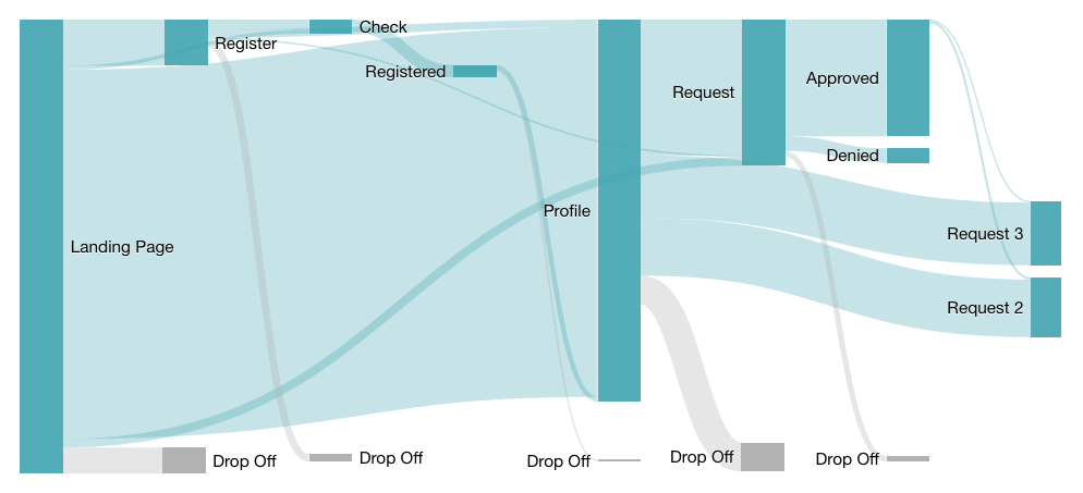
A sankey chart is perfect for showing user flows on a website
Custom charts can really be game-changing. There are many more useful chart types than bars, pies, timelines, and geomaps. While it’s always possible to visualize the data with a standard chart from a generic tool, custom charts are tailored to data peculiarities, making it easy to spot important properties. Many times I witnessed my clients having a clear business advantage by making the effort to craft a custom, themed dashboard, rather than using generic charting tools.
7. Show relations between metrics
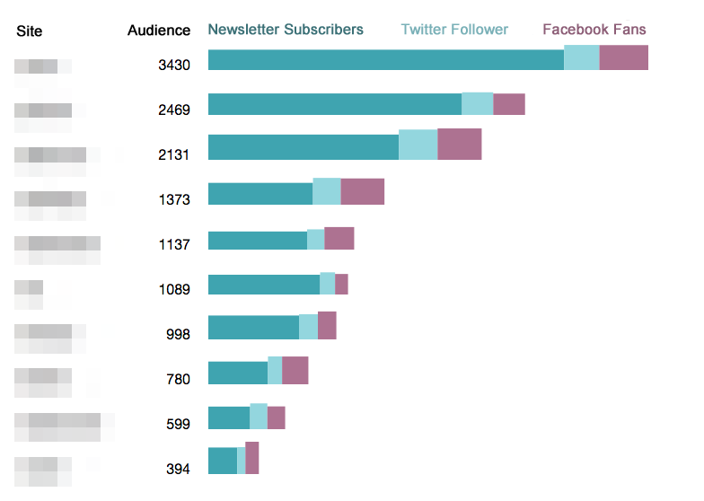
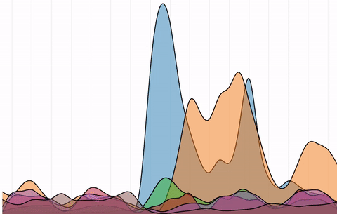
Stacked bars are perfect for showing part-to-whole relations between metrics.
Sometimes it is not only important to show the relations of items within one metric (e.g. compare click rates of campaigns), but to show relations between metrics. And there might be more than just correlations in your data. For example, an implicit part-to-whole relation can be shown with stacked bars: newsletter subscribers + Twitter follower + Facebook fans = total audience. Your self-service reporting tool might not support stacked bars from multiple metrics, though. This is another good reason to use custom chart types!
8. Animation provides consistency
Motion can be so helpful to explain the relationship between views. Never hesitate to invest extra effort into building animated transitions! Animating a visualization between two states when underlying data changes is a powerful way to provide consistency. If the user understands the simple chart, let’s say a timeline with more than one line, an animated transition to a stacked area chart will effortlessly explain this area chart, much better than any tool tip wording ever can. You can even explain histograms this way!
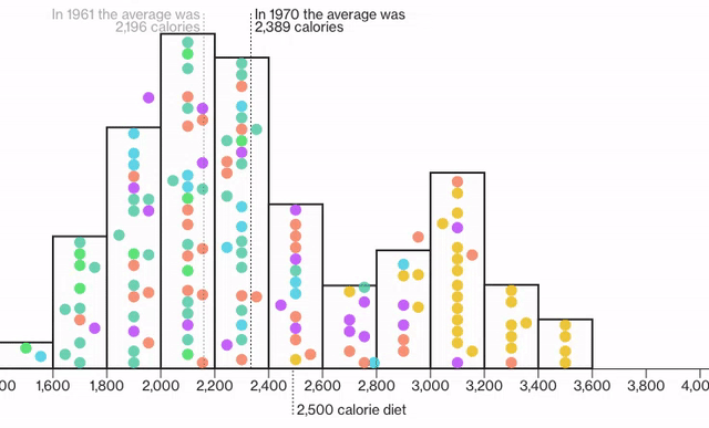
Watch the global food supply increase: an animated histogram makes it easy to understand histograms! Source: Tozzi and Diamond, Bloomberg
Transitions make it easy to understand a stacked area chart. Source: Nathan Yau, Flowingdata
9. Add icons or images
Source National Geographic
Items on charts and tables can be intimidatingly abstract. What does this row contain? What does this point or line? Although this idea might seem to be nothing more than a gimmick at the first glance, icons and little pictures help users identify items and categories much quicker. In addition, with images, people make an emotional connection which makes it easier to remember the information.
Conclusion: Use custom-made data visualizations for storytelling
There are a lot of possibilities to improve a dashboard, each of which help users to see the story. Unfortunately, it is not possible to build a data-specific tool for everything. Generic tools are certainly justified, especially for exploring a dataset for the first time. They are also great for static data, with the author doing the work. But whenever you are dealing with dynamic data with a defined structure and specific recurring topics, you might want to consider building a custom-made data visualization to get the most out of it.
Did you like this article? We would love to hear your thoughts.