Open Data Platform for Energy Efficiency in Buildings
Kunde: New City Energy LLC
Aufgabe: Relaunch der Open Data Platform BuildSmart DC
Datum: 2018
Buildings account for 40% of total energy consumption in the USA.
One of the main reasons for wasting energy is the lack of publicly available data as a basis for discussion and decision-making by residents, politicians or property managers.
Washington D.C., among other U.S. metropolitan areas, is working on an open data platform for building energy data. The previous version is functionally and aesthetically unsatisfactory, and so I was allowed to redesign the entire website including many new data visualizations.
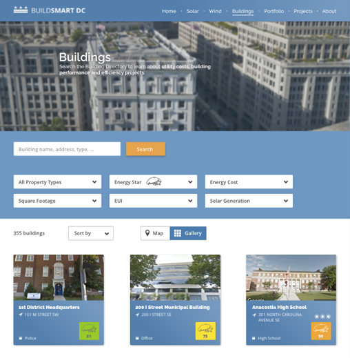
A typical use case: Students and teachers search for their school and then compare it with other schools.
The search is equipped with simple filters, and the results are displayed either as building profiles or on a map. The profile shows the most important key figure, the Energy Star with a traffic light colour, as well as the picture and address.
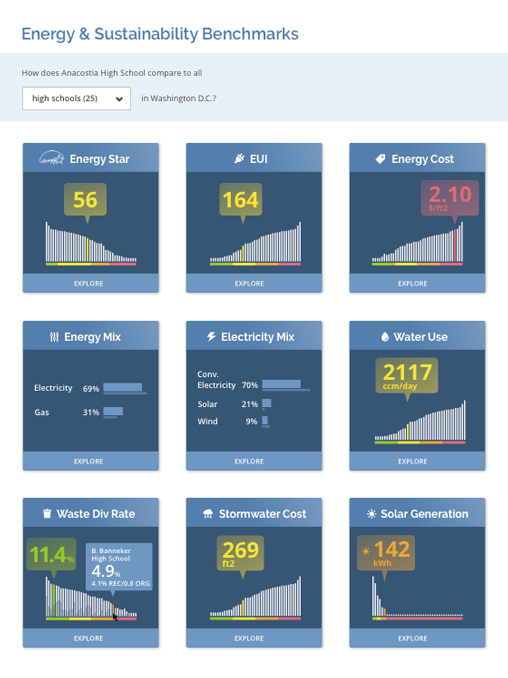
The core of the platform is the building detail page, which starts with a series of benchmark cards for the most important indicators: Energy Star, Energy Use Index, Costs, Energy Mix, Water Consumption and a few more. The traffic light colours help to evaluate the key figures.
The comparison with other schools, other buildings in the district or all buildings in the district helps to classify the energy consumption of one’s own building.
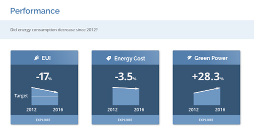
The performance maps show the time course of the most important key figures.
Each benchmark and performance map can be expanded into a detailed chart with additional information such as targets and predictions, baselines and peaklines and, most importantly for me, a guided tour as a reading aid.
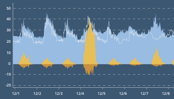
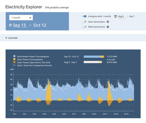
In the Analysis section you will find explorative tools that go into depth. The typical use case for this is the facility manager, who wants to check the effects of changes in building technology on energy consumption. In the Electricity Explorer, he can observe electricity consumption and electricity generation from solar and wind energy almost in real time.
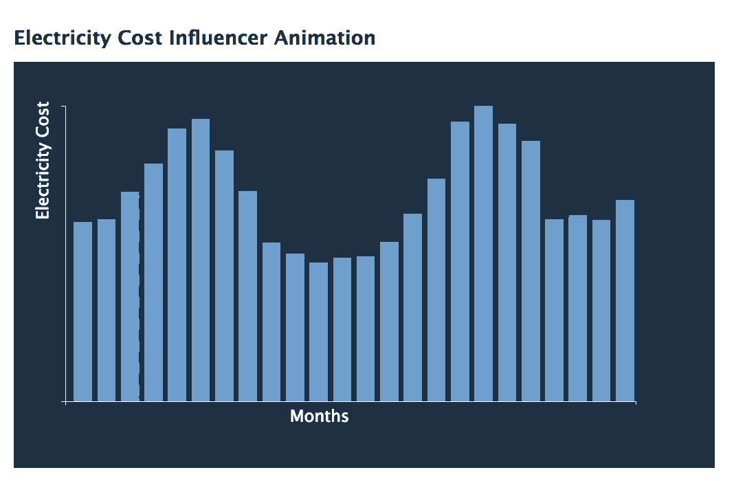
Energy costs are influenced by two factors: consumption and purchase price, and both can fluctuate. A simple timeline of the energy costs per month shows the fluctuations, but hides to what extent the influencing factors were involved. A scatterplot can help here, but it is difficult for laymen to read and the connection to the timeline is not particularly intuitive. Therefore I thought up an animated transition from Timeline to Scatterplot.