Deep insights into the behavior of web user
Customer: Leading ad tech corporation
Task: Visualization of user flow on a website
Date: 2015
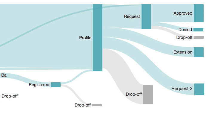
This diagram is intended to show what really happens on a complex website.
Originally we had planned to use a typical funnel diagram/web funnel. But it turned out that there were many different short but relevant funnels. And that there were flows of visitors between these funnels. In addition, some visitors took a few steps back before continuing in the funnel.
And of course the drop-offs. Where did the users disappear to? Did they end their visit to the website completely, or did they switch to pages that didn’t belong to the funnel, such as the help page?
We also wanted to be able to filter the streams according to visitor type: new visitor, returning visitor, etc.
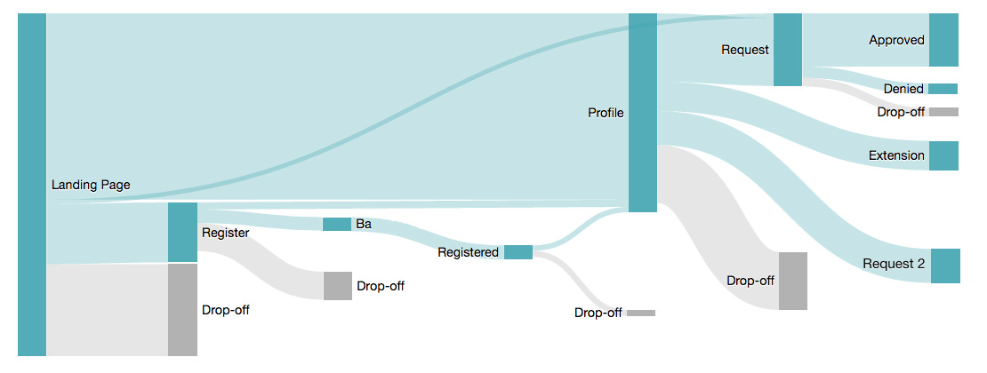
With a Sankey diagram the flows between the steps can be visualized well. A step can have more than one page. But when all flows are displayed, it quickly becomes quite confusing. Only after I had defined certain threshold values and cleaned up the data did I get a clear picture of the visitor flows.
A click on a drop-off shows the most frequent next requests. Often these were help and FAQ pages and other pages that didn’t belong to the funnel.
With this view, we were able to map more complex user flows and also see what those users did who did not adhere to the planned flow.