

Pushing the boundaries: charts with D3.js and DENEB for Power BI
For the sake of the user, challenging the standards of Power BI is a quest in every Power BI project. Here you'll find some examples which we build as sandbox projects, free for your download. Enjoy 🥳 !
1. DENEB custom visuals

Concatenated barchart with line chart
Showing total values and deviations in one chart might be overwhelming. Concatenating two charts is one way out.
Download File (ZIP)
Line Chart with events & rectangle
Adding timestamps to Power BI is somehow annoying. Using DENEB makes it much more easier than.
Download File (ZIP)
Bars with rule marks and UNICODE symbols
This is about management of a chem plant to give overview about the tank fill levels and the state of refill.
Download File (ZIP)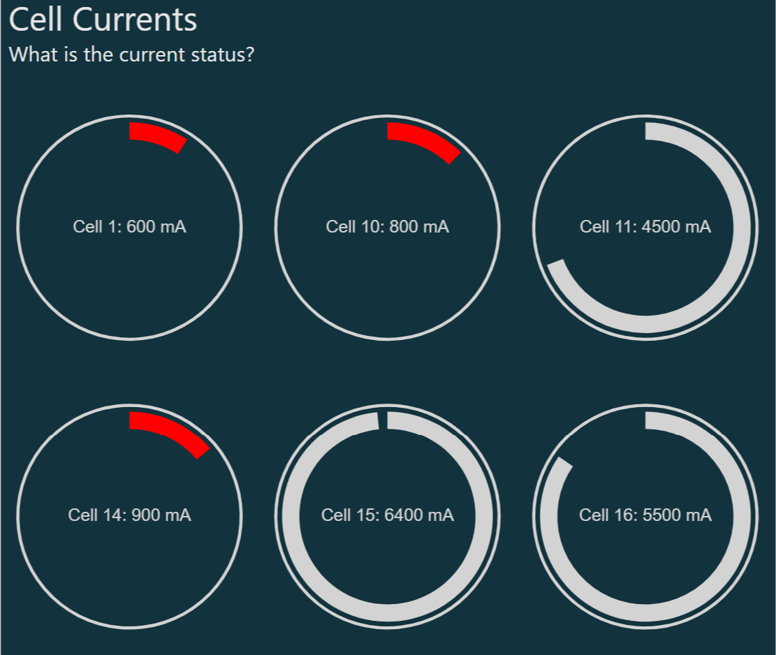
Small multiple gauges
Technical monitoring often needs special approaches. Using small multiples is a powerful way to show high numbers of objects.
Download File (ZIP)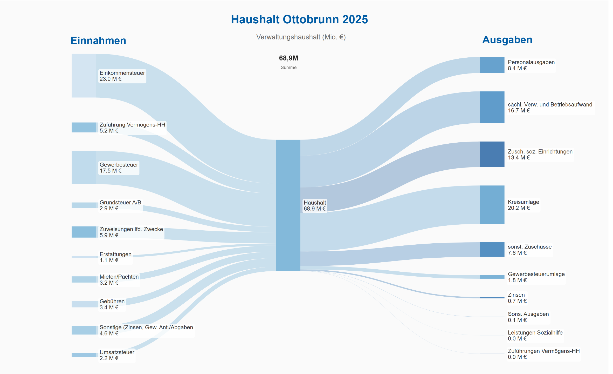
Sankey Diagram
A Sankey diagram is a flow visualization that depicts the movement of quantities between different stages or categories. It uses nodes to represent entities and links (arrows) to show the flow, with the width of each link proportional to the flow magnitude. It's easy to interpret, great for resource tracking, highlights inefficiencies and engages.
Download File (ZIP)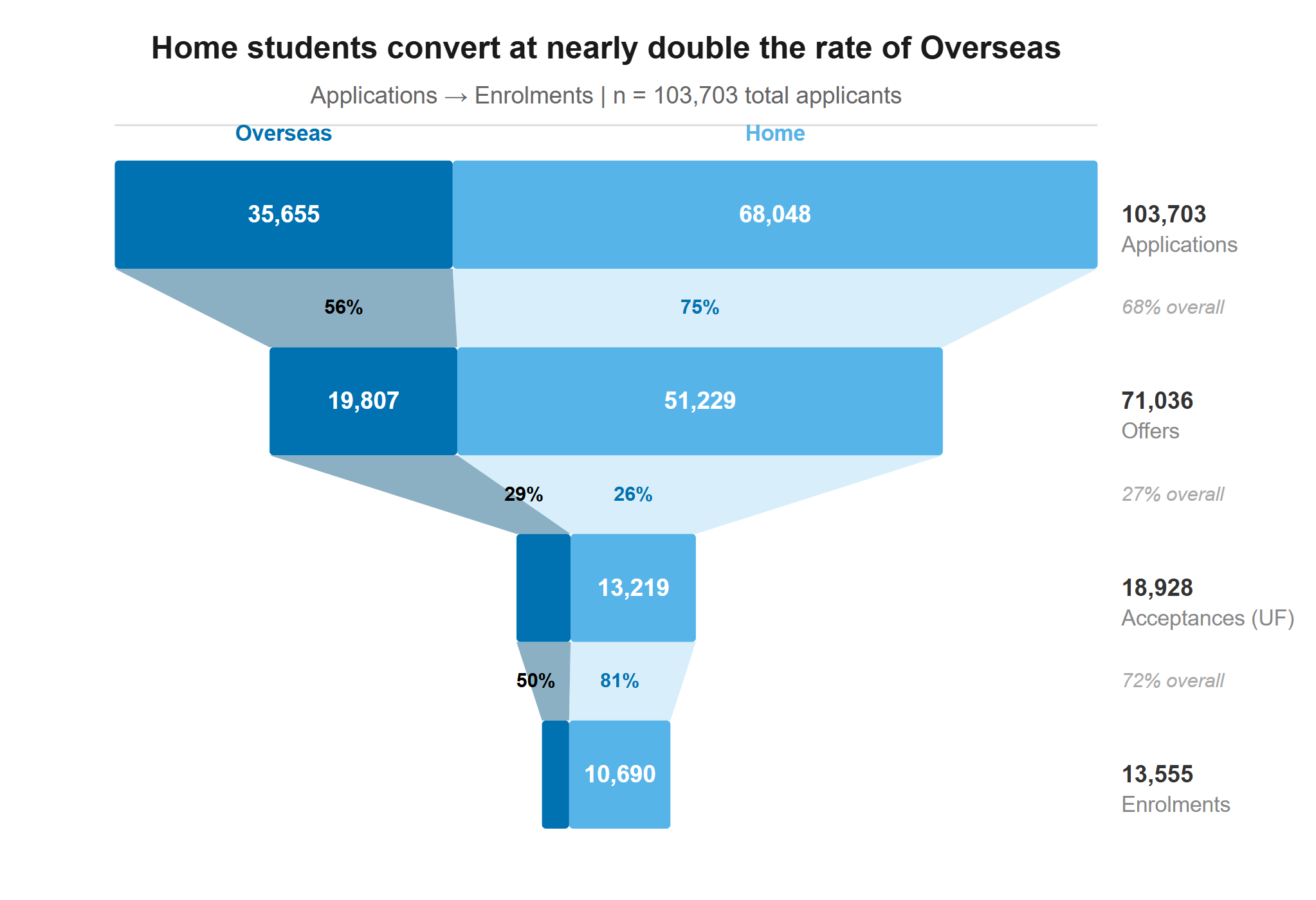
Funnel Chart
A funnel chart visualizes sequential stages in a process, such as sales pipelines. It highlights drop-offs between stages, conversion rates, and overall progression toward a final goal.
Download File (ZIP)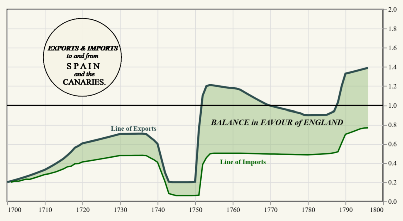
Remake of an historical chart (1)
William Playfair (1759–1823) was a Scottish engineer, economist, and pioneer of data visualization. He invented the bar chart, pie chart, and line graph, revolutionizing statistical representation. His innovative methods made complex economic and social data more accessible, influencing modern infographics and business analytics.
Download File (ZIP)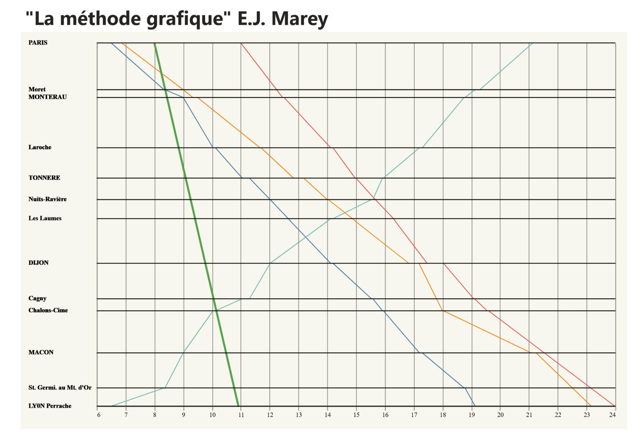
Remake of an historical chart (2)
Étienne-Jules Marey (1830–1904) was a French scientist, physiologist, and chronophotographer. He is best known for his pioneering work in motion analysis and early photography, particularly his development of chronophotography, a technique that captured multiple phases of movement in a single image. His research on biomechanics and the physiology of movement influenced fields such as cinematography, aviation, and sports science. Marey’s work laid the foundation for motion pictures and modern studies of human and animal locomotion. Here is an remake of famous charttype of him.
Download File (ZIP)2. D3.js custom visuals
Multiple line chart with highlighting and tooltips
Sometimes you need advanced formatting options for your data series in line charts. This one is stripped down, scalable to a minimum, highlights and still shows tooltips when you hover over it.
Download File (ZIP)Stacked barchart with highlighting and data lables
Let's bring some user interface standards into Power BI using D3.js visual from the market place.
Download File (ZIP)Side-by-side bars with highlighting
Wouldn't it be nice to make your charts more interactive for better reading? Here is an example of a bar chart which gets highlighted, when hovering over the legend
Download File (ZIP)Bar chart with slider changing values
Sometimes you wish you could simulate a few scenarios in your tools. Unfortunately, this is not possible in the standard visuals. However, D3.js also offers an interesting option here.
Download File (ZIP)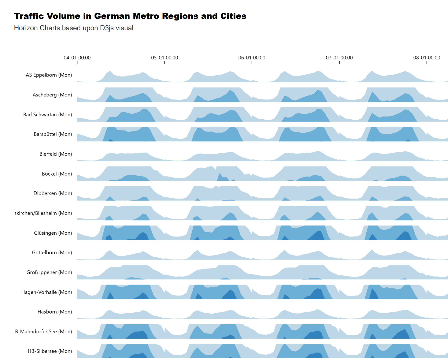
Horizon charts
Horizon charts are a compact, efficient way to visualize time-series data with multiple categories. They excel in situations where you need to compare trends across multiple series without taking up too much space.
Download File (ZIP)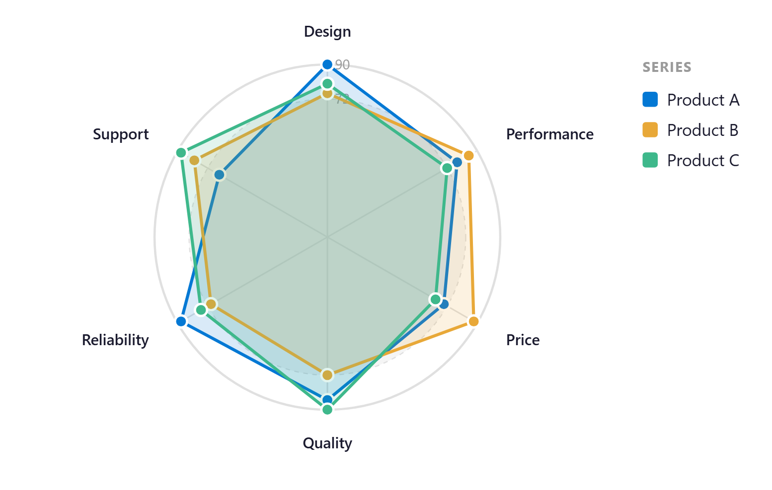
Radar charts
Radar charts visualize multivariate data by displaying variables on axes radiating from a central point. They help compare profiles across categories, reveal strengths and weaknesses, and highlight patterns or imbalances.
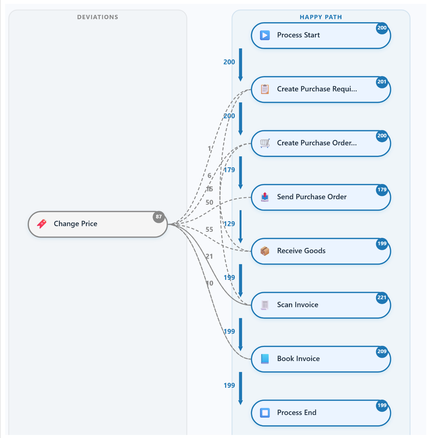
Direct Follower Graph
A direct follower graph visualizes sequential relationships between activities or events. Commonly used in process mining, it shows how often one step directly follows another. This helps identify dominant paths, bottlenecks, deviations, and opportunities to optimize workflows or improve process performance. See more ..
On Demand - Mail to office @designation.eu
