Business Clarity on Moving Runways
Taking confident decisions under pressure. Staying accountable.
FP&A Coaching
All about transformation in finance organizations
The Power of Thinking Dynamically: SCENARIOPLAY
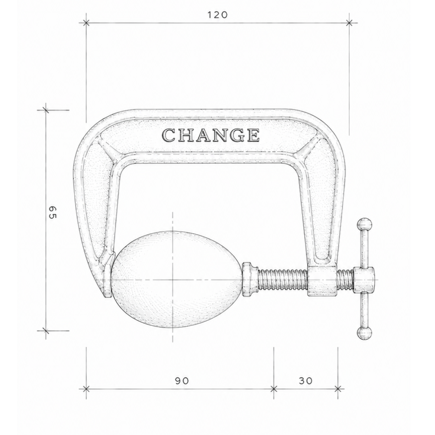
Proper scenario planning doesn't replace your tools. It makes them honest — by forcing assumptions into the open, stress-testing them against plausible futures, and showing how your systems behave under pressure.
Data Product Design
'Leaving flatland behind' - data products for business experts
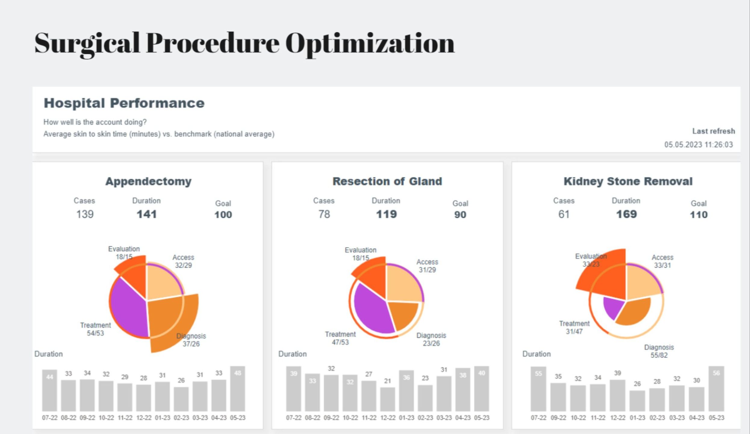
In today's business, data is often mission-critical, overly complex, and decision-makers everywhere are pressed for time. 95% of enterprise dashboards do not adequately address these challenges. They remain "flat", in the words of the famous Edward Tufte. As a result, they add little or no value. A deep understanding of the business domain, the mastery of multivariate data and the development of meaningful visualisations for the user are the key success factors for enganging data products.
At Designation, we focus on applying the magic art of 'semiotics', the ability to express often complex real-world things with the visual means of tools for human beings. We specialize in creating user-centric and domain-focused data product designs to tackle real business problems. Our custom dashboards empower business experts to uncover insights with ease and make decisions with confidence.
A critical view on our widespread and beloved visual display
Dashboards are nowadays the way-to-go for presenting data. Providers of tools and AI solutions suggest that everything can be done automatically and without effort with their solution. However, the triple jump from the data over the tools to the dashboard does lead to nothing because essentials are intentionally overlooked.
Don't be fooled: We all need a different approach ...

From problem to solution: Get your project started ...
Hi, I'm Christoph. As an analytics professional, I have been working with data products my entire career and have made custom visual development my business.
I have always been fascinated by how they work in general and how they can best provide insights for decision making.
Beyond bar & line charts: things in data viz we are doing ...
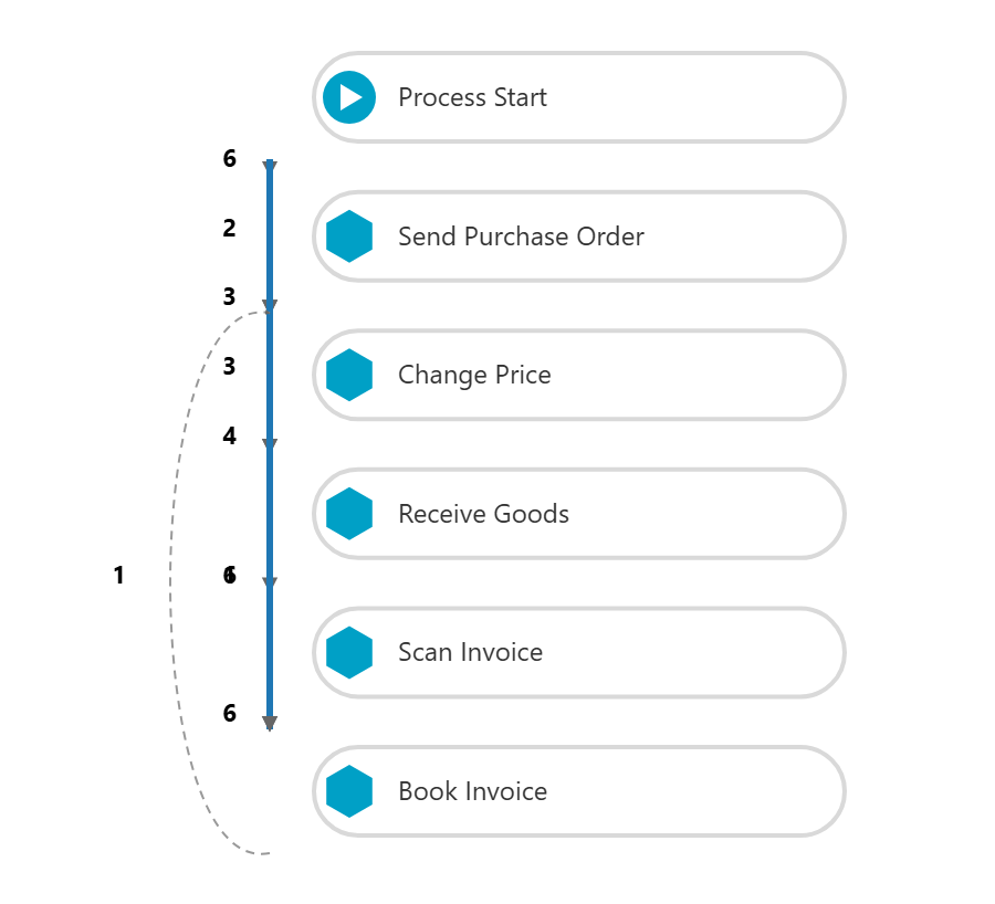
Custom visuals for process mining with Power BI
We transform complex event logs into clear, custom process stories — blending precision, context, and aesthetics for faster insights, stakeholder alignment, and confident decisions.
Read more ...
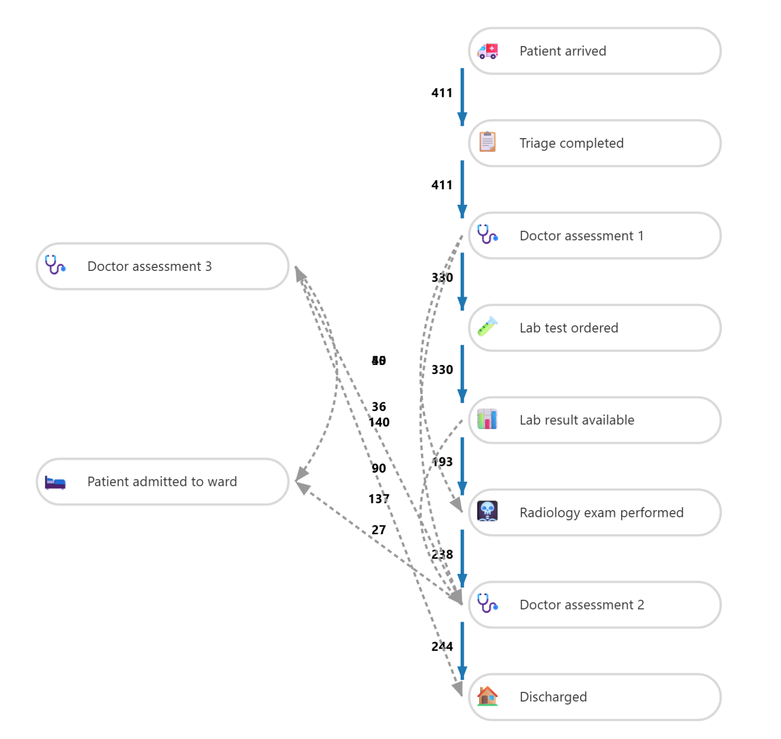
ECU - A Process Mining Use Case
Doing first steps in process mining isn't complicated at all.
From the scratch: this is all you need to have to get started with process mining in Power BI.
What customers and experts say ...
Patrick Bajer, EMEA Senior Commercial Manager @ Johnson & Johnson
"Christoph has an excellent business acumen which lets him come up with laser focused questions and design proposals. Feedbacks on our data products have been excellent. Looking forward to keeping collaborating!"
Grit Böhnisch, Business Steering Manager at Deutsche Telekom
"I want to give a shoutout to Christoph and Evelyn, our outstanding data literacy and data visualization trainers! They're real game-changers, showing us that data visualization isn't just about fancy graphics – it's the key to unlocking answers to vital questions."

Evelyn Münster -
MD & Partner @ Chart Doktor
"Christoph excels at creating customer-centric data products that go beyond standard visualizations, using DENEB and SVG to innovate and deliver impactful visualizations."
The road to user centricity: data product design strategy
If you can't describe what you are doing as a process, you don't know what you are doing (E.Deming). Now uncovered: here is how we develop user centric data products.

1. Dive into the business domain
Each business domain has its own structure: components, players, dependencies, goals, performances, metrics and so forth. In addition business domains tend to have comparable data structures. And business people have their mental models of behaviours and feedback loops. It's crucial to get a handle on the domain and its drivers before diving into problem solving.

2. Understand the business problem
Data in business is there for problem solving, but normally it is not in shape to give answer directly to your needs. Transformation needed, but in which direction? Start with having a well elaborated problem definition before diving into the data realm and getting it organized by transformation. At the end a real data-problem fit is required.

3. Set up the analytic tree
Before writing a bunch of measures, it's crucial to define the North Star of your dashboard: what is the most important data question that pops out of your business problem? And what are the follow-up data questions and contextual topics you need to add to relate to knowlegde, build trust and support your users' mental models? Setting up the right analytic tree is the way to go here.

4. Ideate on visuals & metrics
Once you have defined the relevant questions and the desired analytic tree, you can easily start visualising your ideas. This is where the magic happens. Visualisation experience, knowledge of graph types and creativity come together. Building on the previous work, you begin to connect all the relevant dots and this is where you can make the difference for your users.

5. Build the semantic model
The next step is to start transforming the data. Each visual requirement has its underlying data table, and by selecting the required records and dimensions and adding metrics, you are on your way.
Writing and organising your code to keep it efficient and setting up a deployment pipeline is basic work for any BI developer.

6. Feedback from the users
Once you have your dashboard ready you need to test and review with your audience. Does the data answer the question your users have? Are further data needed to increase dashboard engagement?
Monitoring dashboard adoption over its lifetime is an essential step for setting new impulses for improvement.
Growing collection of D3.js and Vega-Lite examples for business realized in Power BI
From time to time we use charts from the official Vega-Lite website in our projects. Here you'll find some examples for your free download. Credentials appreciated.
Download page