
A Pattern Language for Visual Analytics - with Business Focus 😎
As analysts, it makes sense for us to view graphs and charts as statements that we make about reality.
Each type of chart provides an answer and this should adhere to certain rules and conventions (patterns). The better we understand these patterns, the easier it will be for us to communicate and catch the attention of our readers on his analytic journey.
But remember: the journey starts not with the answer, but with original question the reader has in mind.
Level 01
Visual Analysis
Using individual charts as instruments to reveal patterns, trends, and anomalies in data.
Charts
Level 02
Analytic Journey
Sequencing charts and filters to mirror the user's natural chain of questions — from trust to insight.
Charts + Filters
Level 03
Analytics Process
The end-to-end business cycle: from system mapping through intervention to expert evaluation.
Process Cycle
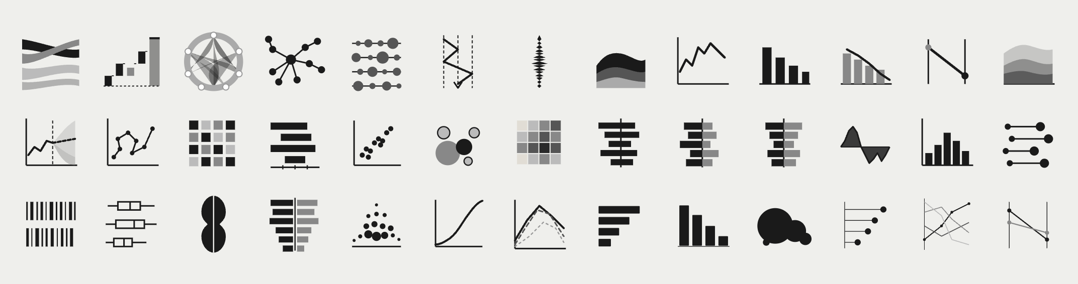
Visual Analysis
6 Chart Families
For Client Presentation
| 1.1 | Composition | What is it made of? Charts that show how a whole is divided into parts at a point in time. Reveals proportional structure and dominant contributors. e.g. Pie, Treemap, Stacked Bar |
| 1.2 | Comparison | How do items differ? Charts that place values side by side to surface relative magnitude, ranking, or deviation across categories or time periods. e.g. Bar, Column, Bullet, Small Multiples |
| 1.3 | Trend & Distribution | How does it change or spread? Charts that reveal movement over time, volatility, and the statistical distribution of a variable across a population or range. e.g. Line, Area, Histogram, Box Plot |
| 1.4 | Relationship | Do two variables move together? Charts that expose correlation, clustering, or outliers between two or more dimensions simultaneously. e.g. Scatter, Bubble, Heatmap |
| 1.5 | Flow & Process | Where does it go? Charts that trace volume, conversion, or movement through sequential stages — revealing drop-off, bottlenecks, and throughput. e.g. Funnel, Sankey, Waterfall |
| 1.6 | Performance vs. Target | Are we on track? Charts that compare actual values against a defined reference — a target, forecast, prior period, or benchmark. e.g. Gauge, Variance Bar, KPI Card |
Always start with the analytical question, then select the chart. Never the reverse.
Each visual should answer exactly one question clearly. Complexity is a symptom of unclear purpose.
Business analysts tolerate density. Executives need immediate signal. Match complexity to reader.
The Analytic Journey
5 Journey Layers
For Client Presentation
An experienced analyst may enter at the driver level and skip orientation. A manager may need the overview before any detail.
Operational dashboards prioritise recency and throughput. Strategic reviews prioritise trends and benchmarks.
A known gap triggers a diagnostic journey. An open question triggers an exploratory one. The entry point shifts accordingly.
| 2.1 | Data Trust Layer | Before any analysis begins The first question any user asks — consciously or not — is whether the data is current, complete, and reliable. This layer surfaces data freshness, source, and any known quality issues before the user invests in interpretation. Typical visuals: Last-updated stamp, data completeness indicator, source label |
| 2.2 | Orientation Layer | Where am I and what am I looking at? Contextualises the user within the data: time period, scope, segment, and scale. Filters here set the frame for all subsequent visuals. Typical visuals: Period selector, scope filter, summary KPI cards |
| 2.3 | Key Metric Layer | How are we performing? Presents the primary performance indicators relevant to the business problem. Designed to surface signal quickly — actual vs. target, trend direction, and magnitude of deviation. Typical visuals: Variance charts, trend lines, benchmark comparisons |
| 2.4 | Diagnostic Layer | What is driving it? Enables the user to decompose performance by dimension: region, product, channel, time sub-period. Filters at this layer are contextual — they follow the question raised in the metric layer above. Typical visuals: Breakdown charts, contribution analysis, comparative small multiples |
| 2.5 | Detail Layer | What is the underlying record? The terminus of the journey for users who need to act on specifics. Row-level or transaction-level data, accessible only after the higher layers have guided the user to a precise question. Typical visuals: Filtered data tables, drill-through reports, exception lists |
The visual sequence should match the order in which a user naturally builds understanding, not the order data is stored.
Filters are not global controls. Each filter belongs to the layer where it is analytically meaningful.
Design multiple journey entry points. Role, experience, and problem type determine where a user starts.
The Analytics Process
10 Steps · 3 Phases
For Client Presentation
| 01 | System Mapping | Formerly: "Draw the system" Produce a structured representation of the business system under analysis — its actors, processes, inputs, outputs, and interdependencies. This may take the form of a process map, value chain, or causal loop diagram. Deliverable: Visual model or diagram |
| 02 | Data Acquisition | Formerly: "Get the data" Identify, access, and validate the data sources relevant to the system. Establish data quality, completeness, and recency before proceeding. Deliverable: Verified dataset or data inventory |
| 03 | Outcome Definition | Formerly: "Define the outcome (JTBD)" Articulate the underlying job-to-be-done: the functional, emotional, or social objective the system is intended to fulfil. This anchors all subsequent measurement in purpose rather than proxy. Deliverable: Outcome statement |
| 04 | Performance Metric Definition | Formerly: "Define the measurable output" Translate the outcome into quantifiable indicators. For each metric, define the target value (desired state) and establish the method for capturing the actual value (current state). Deliverable: KPI register with target / actual schema |
| 05 | Gap Analysis | Formerly: "Measure the gap" Quantify the delta between target and actual performance. Prioritise gaps by magnitude, strategic relevance, and tractability. Deliverable: Gap report with prioritisation matrix |
| 06 | Solution Ideation | Formerly: "Ideate about solutions" Generate a structured set of candidate interventions that could close the identified gap. Apply structured divergent thinking techniques (e.g. How Might We, root-cause ideation) and document assumptions for each option. Deliverable: Longlist of solution candidates |
| 07 | Scenario Modelling | Formerly: "Simulate action" Before committing resources, model the projected impact of candidate solutions. This may include financial modelling, process simulation, A/B test design, or stakeholder scenario planning. Deliverable: Impact model or pilot design |
| 08 | Implementation | Formerly: "Take action" Execute the selected intervention according to a defined change plan. Ensure accountability, resource allocation, and a measurement protocol are in place before go-live. Deliverable: Change log and execution record |
| 09 | Results Measurement | Formerly: "Measure the result" Re-measure the KPIs defined in Step 4 under comparable conditions. Isolate the effect of the intervention from confounding variables where possible. Deliverable: Post-intervention KPI report |
| 10 | Expert Review | Formerly: "Evaluate from a professional perspective" Conduct a structured retrospective using domain expertise. Assess whether the outcome (Step 3) was achieved, whether the methodology was sound, and what should be carried forward into the next analytical cycle. Deliverable: Evaluation report and cycle recommendations |
Define the job-to-be-done before defining metrics. Metrics serve outcomes — not the reverse.
Modelling interventions before committing resources reduces costly implementation errors.
Step 10 feeds back into Step 1. The framework is a loop, not a linear checklist.
