Data are abstract and often difficult to understand. Nevertheless, they often contain valuable information. Why is it so difficult to obtain and communicate this information?
Many complex systems we are dealing with today, such as production processes or customer lifetime journeys, are largely invisible. Only through the indirect route of data collection and analysis can we understand these systems to such an extent that we can identify and solve problems.
Data visualizations are the friendly access to this data. They should also enable non-techies to read and interpret data.
However, the colourful and appealing presentation leads us to think that everything is easy and nothing can go wrong anymore.
But it’s not that simple. Data visualizations are very often not understood. If you have observed this before, either as a reader or as a creator of visualizations, then you should read on.
According to my observations, a lot of things can go wrong. For over ten years I have been developing user interfaces for data products and I have made the painful experience that visualizations often don’t fulfill their purpose. The users don’t understand the visual language, can’t grasp the data structure, or can’t understand the meaning of the presented data. In some particularly ambitious business intelligence projects, we found that the visualizations were rarely used afterwards. But why is that? And how can you do better?
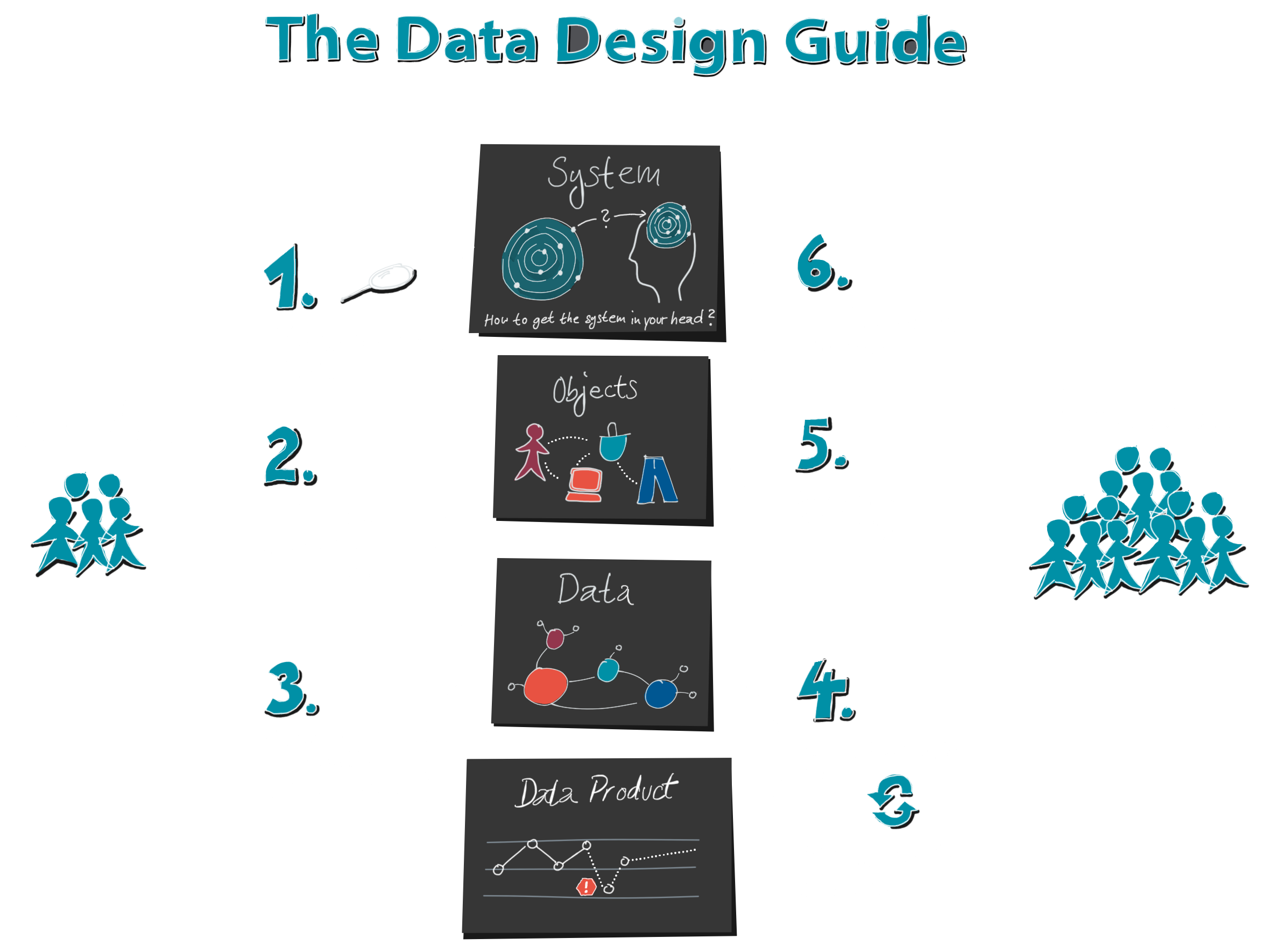
1. Let’s take a look at the process of creating data visualizations. It doesn’t start with the data, as is often assumed.
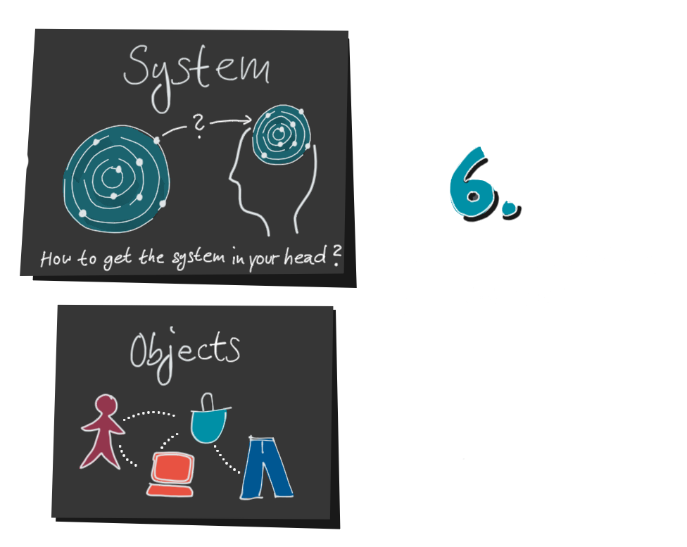
It starts much earlier, with the system behind it.
Because behind all the data lies a system in the real world. It is usually invisible and very complex. Take a web shop, for example. Nobody can simply see the streams of visitors.
First we need an idea, a mental map of this webshop, to decide which objects, properties and events we want to measure: Visitors, websites, shopping baskets and products, there would be many things that could be interesting. But not all things we can measure technically, like the thoughts of a webshop visitor while he decides not to buy a product in his shopping cart. How nice it would be to know that!
Likewise, our mental map could be incomplete, inaccurate or simply wrong. Then we might not ask the right questions and measure the right data.
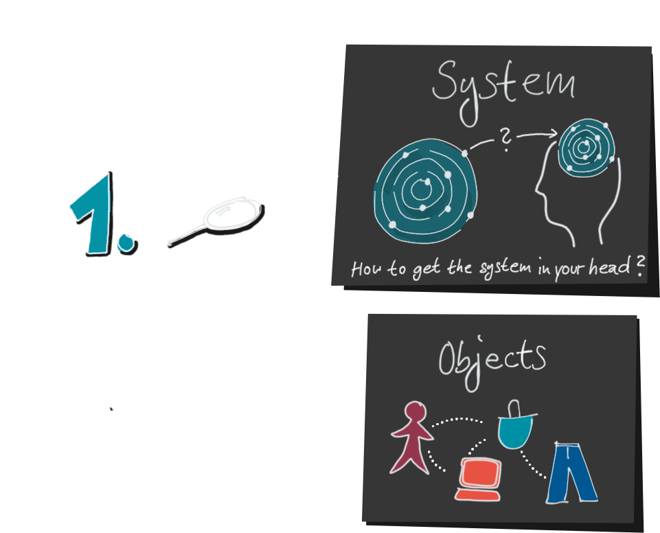
2. Next, we create a data model. Here, too, a lot is lost, because a data model cannot capture every detail of the real world. Anyone who has ever done this knows that an inflated data model is a dangerous monster. That’s why we prefer to stay as simple as possible and leave out unimportant details.
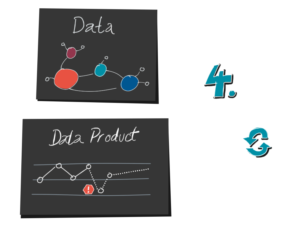
3. After we have collected data and processed it, we finally create our visualization. Up to this step, two things happened that we should keep in mind:
First, not all of the complexity of the system is visible in the visualization, and second, we encrypted the system twice.
First it was translated into the data, and then the data was translated into the visualization. That is why we call this process encoding and the producers of data visualizations encoders.
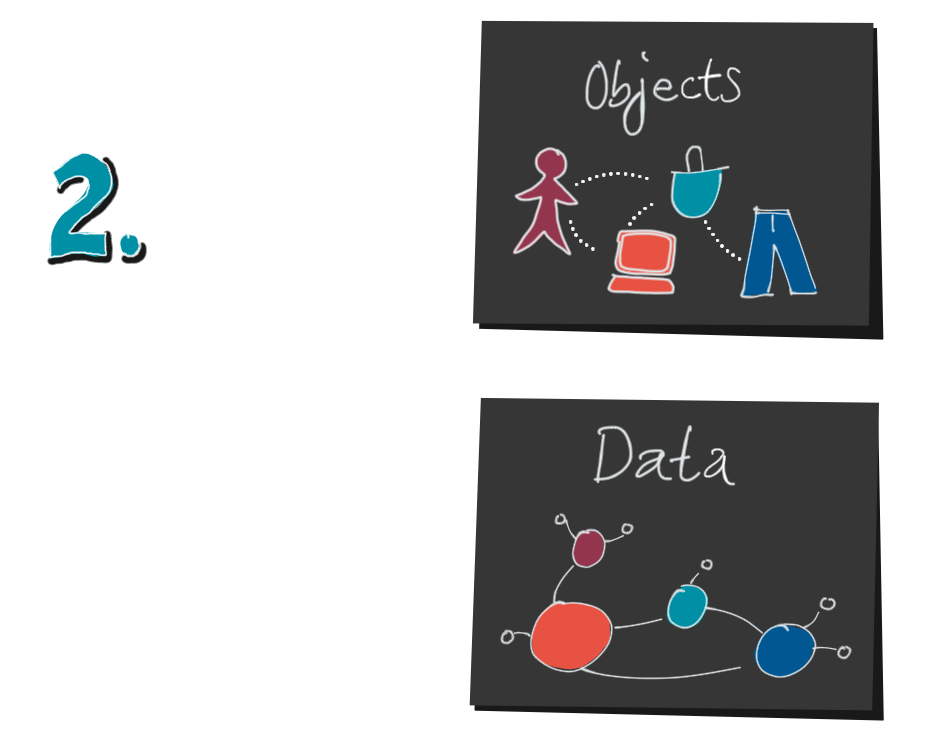
4. Well, are we done now? Not at all, because now comes the second half, decoding. A decoder is a reader of a visualization.
In order to understand the system and to get action-relevant insights, the decoder has to go backwards again:
from the data visualization to the data, and from the data to the mental model. He wants to confirm, refine or change his own mental model with the help of the data. How can he do this?
In the first step, the reader has to crack the translation key. What do the lines, points, position and color mean? What does the axis label and the legend say? At the same time he tries to recognize the data structure. These points in the timeline, are they clicks per hour per country? Or per product?
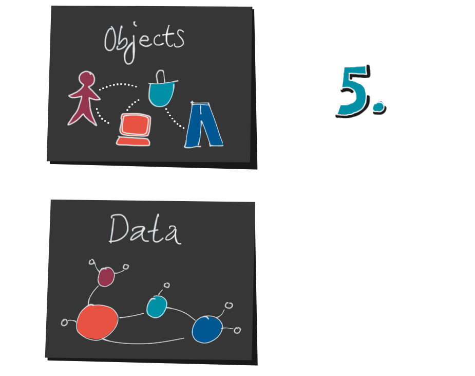
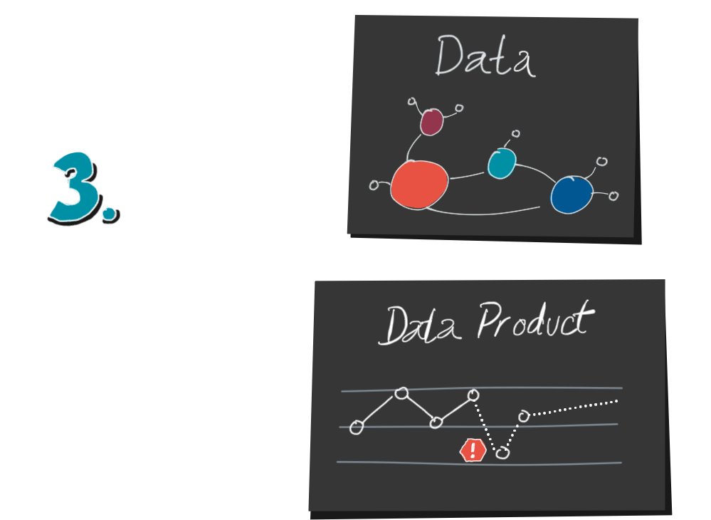
5. As soon as he has succeeded in decoding the data structure, he can get an idea of the objects. Statistical knowledge is helpful for this. Are these absolute or relative numbers? How large is the population? What are the proportions and relationships between jeans, clothing sizes and orders?
This information is purely quantitative. He knows that something has happened, but not why. Why do we sell so many oversized jeans? Why did we sell 17% more last Saturday than the average Saturday? This is where his domain knowledge, his mental map of the system comes in. The context lost through encoding has to be added again.
Because we cannot interpret data without causality.
We need detailed knowledge, based on our own experiences and stories. We humans are causality machines. Data without context remains meaningless to us.
A healthy dose of critical thinking is also part of it. What motives did the author have? Which data is missing? Can the data be correct? Were there measurement errors? Are there any uncertainties? Do I myself have a cognitive bias? Which statements can I derive from this and which not?
6. If data and mental model fit together, the decoder can now interpret the data and gain actionable insights. He can expand his knowledge and improve his mental map, or ask further specific questions.
As we have seen, however, the road to this is a long one. There are many dangers lurking.
Only the one who keeps an eye on the complete process and also supports the readers where they need it (data competence and data literacy) will be able to build a successful data product or an efficient visualization.
Edit 10/21/2019
I am pleased that the Data Design Guide has been included in the study “Future Skills: A Framework for Data Literacy” (in German) by Hochschulforum Digitalisierung. It serves as the basis for the framework for data literacy developed there. “Analogous to the evaluation criteria for language skills, the competence framework developed here distinguishes between coding and decoding processes.”
A Designation brand
The Chart Doktor
Data Design Academy
Learn how to turn your users into real fans with impactful data visualizations. Learn how to design groundbreaking data products that people can’t live without.