Data UX Design for Data Products
We design purpose-built data visualizations and data products that go beyond dashboards and reports to enable actionable insights for everyone.
Have you ever experienced that communication with data – dashboards, reports, visualizations – went completely wrong?
Human perception is not optimized for reading abstract data. Even if data is presented in colorful and appealing visualizations, it is not trivial to read the underlying data structure and interpret it correctly.
The encoding of data into visual forms and their decoding by the reader is a complex process that often fails in whole or in part. And even if it succeeds, the subsequent interpretation often fails, so that the reader does not receive the desired actionable insights despite the great effort.
This is a big challenge for business intelligence, big data analytics and data science. With growing data volumes and the new possibilities of artificial intelligence, the complexity of the tasks in designing digital products also increases.
But according to experts, the last step of the data lifecycle, visual communication, is where the greatest value lies. After all, this ultimately ensures access to the data gold.
On the one hand, the entire data pipeline is worthless without effective data visualization. On the other hand, a successful data user interface can reduce customer acquisition costs: Everyone can see at a glance what they can do with the digital product.

Are you faced with a hopelessly tangled ball of wool of complex data and unclear user expectations? We’ve already unraveled some of these clusters and turned them into successful data products. To do this, we use the innovative data product design process we have developed. It is based on the Data Design Guide, the Guide to Actionable Insights and our years of experience in data design, software development, data science and business design.
A Designation brand
The Chart Doktor
Data Design Academy
Learn how to turn your users into real fans with impactful data visualizations. Learn how to design groundbreaking data products that people can’t live without.
Portfolio: Data Visualization in Data Science Products

Figurative process analytics
A new data language for process mining. Sometimes you just can’t get anywhere with aggregated data.
Visualising the energy efficiency of buildings
How can you quickly compare the energy consumption of different types of buildings? What are the concrete optimisation potentials for buildings?
Customer Journey Explorer for Multichannel Marketing
Sometimes a new look at individual user journeys helps in process analysis beyond the typical aggregated graph view of many tools.
Building trust in algorithms
A challenge for software sales: AI can do some things better than human experts. But how can these experts trust the new solution and recognize its real value?
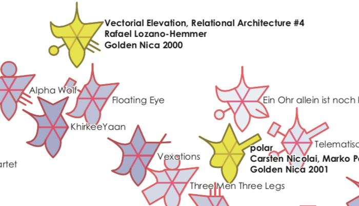
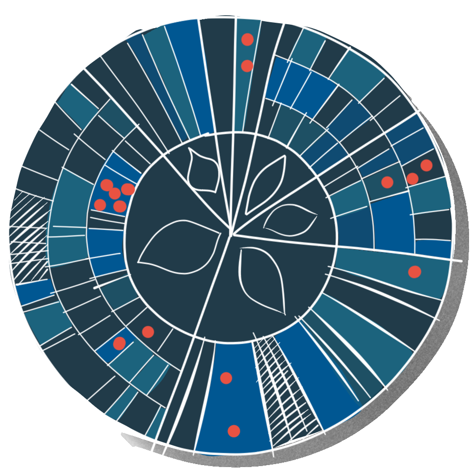
New data language for media art
Media artworks are represented as glyphs and grouped thematically in a landscape.
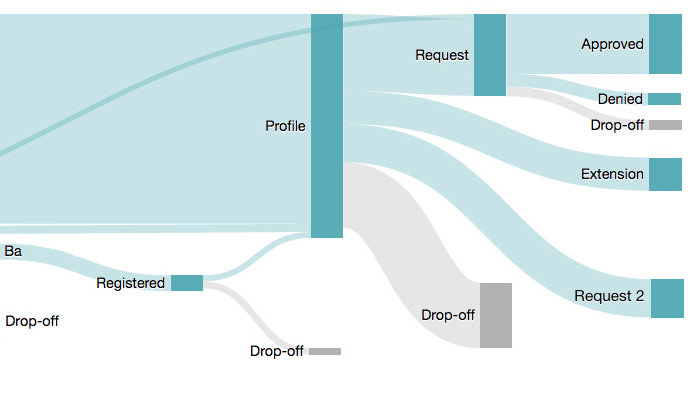
Deep insights into the behavior of web users
Existing webfunnel representations have not convinced us. This Sankey diagram shows what really happens on the web application.
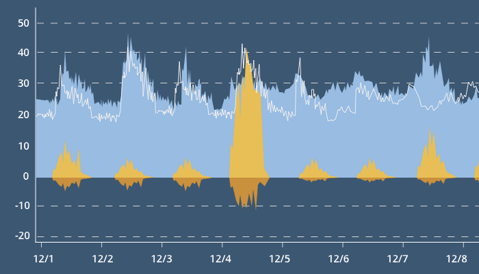
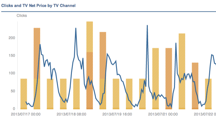
Man vs. Machine: TV Campaign Comparison
Algorithms are better than humans at optimizing TV campaigns. The goal of this data visualization is to show this.
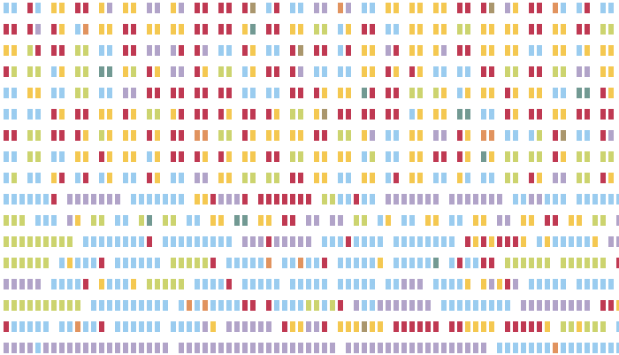
Online Marketing Analytics Platform
A self-service reporting platform that has been specially adapted to the user needs of online marketing agencies.
Evelyn is simply the woman who knows how to conjure up great visualization concepts from a good idea. The absolutely right choice – especially for the difficult questions.
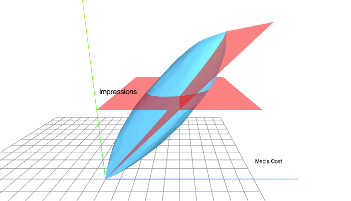
We needed to explain something complex and geometrical to prospective clients. Explaining it took us 3 hours, which was definitely too long and tedious.
When we met Evelyn we expected that there is no way a data visualization designer would understand what we are talking about – after all this was complicated math. And even if she did, how can you possibly compress a 3 hour explanation any further?
What we learned over the course of this project was that Evelyn
- was spot on with all explanations.
- came back with a beautiful animation for a 3D geometrical concept that did indeed explain the core idea like in seconds.
- project managed the whole thing.
If I did not witness this myself I would not have thought it was possible.


Evelyn Münster
Data Visualization Designer
What you can hire me for:
- Data visualization design
- Data design thinking workshops
- Prototyping and development with d3.js
- Workshops and trainings for Data Scientists, Designers and Business Experts
Drop me a line: office@designation.eu