Man vs. machine:
TV Campaign Comparison
Customer: Us-American broadcast network
Task: Visualization of campaign performance
Date: 2016
Algorithms are better than humans at optimizing TV campaigns. The goal of this data visualization is to show this.
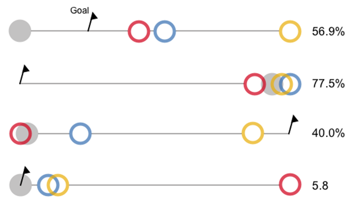
Comparison Chart
In this interface, users can use machine learning to compare optimized TV campaigns (the colored circles) with a baseline (gray dot). The baseline is the standard, manually controlled campaign performance. In addition, there is another goal that is to be achieved (the flag).
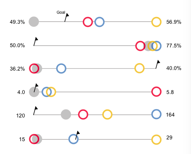
So we are dealing with five different values: one goal, one baseline, and three campaigns. Normally you would use a simple bar chart to compare these values. But bars can’t be truncated because the length represents the value. We expect that we will often have to deal with values that differ only slightly, but are very high, such as 250,000, 249,800, and 250,020. In terms of bars, you would see almost no difference.
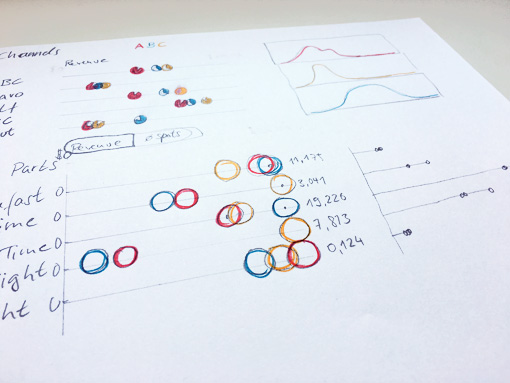
That’s why I developed this custom chart, inspired by the dumbbell chart. It ranges in length from the smallest to the largest value, which acts like a zoom on the minimal differences. Each ratio also has its own scale, because it makes no sense to compare apples with pears.
To make the diagram aesthetically pleasing, I used circles instead of dots, and a flag icon. Overlaps are also easier to see with the circles. And overlaps can occur here very often.
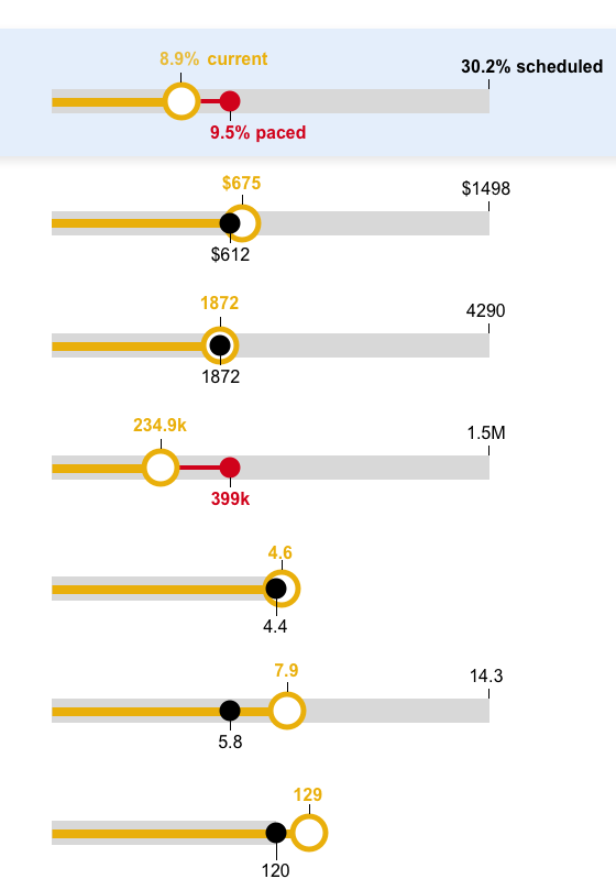
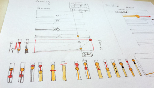
Pacing Chart
While a campaign is running, users should be able to check in a pacing chart whether the campaign will achieve its goals. Pacing has a confusing number of data points:
- The current value
- The planned value (target)
- The paced value (this should be the current value if the target is to be reached on time)
- The predicted final value (if the campaign maintains its pace)
- The time span (start and end date)
- The current date
In order to keep it as simple and meaningful as possible, I used only 3 values: current, paced and planned value. The black dot is the paced value. If it is enclosed by the yellow circle, you know that the campaign is running perfectly and will reach its goal exactly. If the yellow circle lags behind, the black dot turns red to indicate that there is a problem. If the yellow circle is ahead, the campaign is likely to exceed its target.